
Even at the very top-end of the market, there is never a shortage of property available to buy in London.
Our expertise lies in identifying the handful of homes that precisely match a client’s lifestyle needs, then acquiring their preferred option on the most favourable terms.
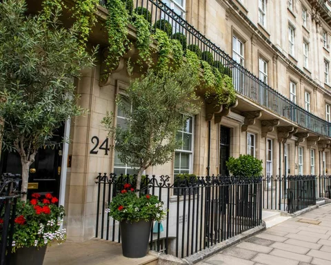


Whether it’s a town house in Mayfair or a penthouse in a new development, we’ve personally visited just about every high-end property that has been sold in London over the last forty years.
We have the inside track on what’s about to come to market, as well as what’s already listed.
Combining 40 years of experience with up-to-the-minute insight, we know what constitutes fair value and how to negotiate the lowest possible price.
Many clients come to us having already found a property to buy and leverage our specialist knowledge to complete their purchase.
Our services extend well beyond the transaction. We can arrange introductions to a wide range of impressively qualified professionals, from educational consultants to architects and builders.


Whatever stage you're at in your buying journey
We would be delighted to hear from you to discuss your own property requirements.
Contact us for an initial chat


Would you like to know more about how Property Vision can help you?
Please enter your details below to download our brochure